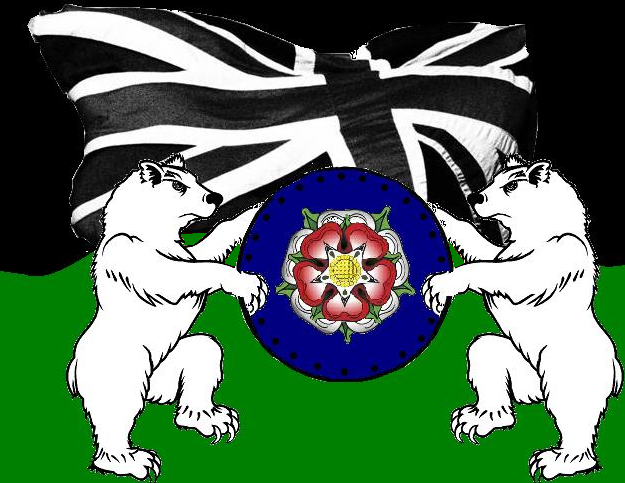
Against the black and green background we have the two roses of Yorkshire and Lancashire, fitting for a border town like Todmorden which allows us to incorporate the red white and blue in an "alternative" setting. The bear is a nice heraldic touch I think, as it lacks the masonic symbolism of the Royal Lion. Finally, the round shield is used by the working class fighter - as opposed to the tall shield used by the government's men.
This is the new campaign logo for my campaign. I did not want to use the colours of "Red, White and Blue" as this has been done to death by the National Front and the British National Party.
As an Independent, the colours of black and green have an appropriate symbolism. Black, while specifically identified with anarchists, as a wider meaning as the colour of the "pirate", ie those not aligned to any political party or major power.
Many Independent candidates use black and white, but many use green and white or sometimes purple and white. I decided against purple as this has been hi-jacked by the "Independent Network" (ie. kosher independents).as well as the kosher conservatives in UKIP.
I hope my supporters like the new logo and colours.
 RSS Feed
